Shapes – Triangles
Shapes exist, they have existed in nature since the beginning, it is the definition of shape that has developed as man has learned to draw, build and manufacture. The more regular a shape the more frequently it is seen especially in the built environment and therefore the more frequently it is recognized in the natural environment.
Regular Shapes have a reason, initially used in manufacture or construction to add strength, some shapes are stronger than others; the more regular a shape is the stronger it is both physically and visually. There are 3 basic shapes, triangles, rectangles and circles, all other regular shapes that we identify with are made up from these 3 basics.
Shape’s in images provide many functions, they can enclose, support, direct and have a stronger physicality than lines because of the greater interaction. Of the 3 basic forms of shape the simplest and strongest is the triangle, it can link 3 points, it can direct the viewer and they can enclose a group, they are also more visible in the natural and built world than other shapes.
The rectangle is more complex for the eye because to link any 3 points without creating 2 triangles involves the eye traveling through a subsidiary point. However because they relate to the shape of photographic film or sensors and because they are seen as enclosures in the built world they are easily identified with. They are less often seen in the natural world and because of the issues of perspective can create issues in photographic composition.
The circle is the tightest form of enclosing shape but is the most difficult to construct without elements that are naturally circular.
The following images show real and implied triangles.
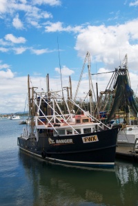
The strength of this homemade boat lies in the triangular sail, which is expected in the mind and the stay ropes for the mast which form a triangle.
Designed to show a triangle by perspective the roof of this Tibetan Building converges to the apex of the image, the resulting subdivisions at the top of the image create more equal triangles while the roof supports create yet more triangles with their point towards the bottom of the image.
This inverted triangle by perspective is an ornamental pool. The repeating triangles from the far edge, its reflection through to the near edge draw the eye whilst enclosing the reflected trees. The small pieces of grass on the left aspect was left on purpose. The image was taken in an area themed as a Japanese Garden and somewhere in my memory I remember reading that Japanese Gardeners would tend a perfect garden but always leave one small detail of imperfection.
This final image was shot at a wedding 2 weeks ago. There is an obvious triangle of the 3 main dancing couples amongst a full dance floor. The apex of the triangle is the Bride and Groom with the other actors in the triangle looking at them.
Assignment 1- Contrast
I have just completed Assignment 1 – Contrast which can be found under the Assignments tab of this Blog. Or by clicking HERE
For the final image of the assignment I have produced a still life. Something very new to myself, the thought of creating an image from scratch rather than photographing something extant was quite daunting. This assignment will now be submitted for assessment and I will discover my assessors thoughts in due course.
Here is the final image.
Peter Adams
I came across Peter Adams on facebook and discovered that he has been posting some short bio’s of many diverse photographers and recollections from his meetings with them for one of his many books. I would commend any Photography Student to find Peter and follow his posts.
https://www.facebook.com/Retepsmada
Peter is publishing @ 3 bio’s per month on FB
His own published books include:
-
A Few of the LegendsAn electronic book of master photographers from around the world
-
Who Shot ThatA Book: Master photographers from around the world
-
Ore WhatA Book: A Portrait of the people of Hill End
-
street wiseA Book: A portrait of the people of the Blue Mopuntains
-
Under The SkinA Book: Nudes
-
Bits Of RustAn exhibition of photographic sculptures made from bits of rusty metal
-
The Digital NudeA Book: How to book on photographing the female nude. (NB: Ghastly title chosen by the UK publisher!)
Peters own biography from his web site http://www.peteradams.com
Peter Adams grew up in the UK, and at age eleven, was given a camera for Christmas by his grandfather. “That small ‘Bakalite’ Box Brownie camera started my life-long love of photography – mind you, it has been interrupted from time to time by other careers.” After high school “which I couldn’t stand and never completed”, Peter took a position as an apprentice toolmaker – the only formal training he ever had. Two and a half years later he became a London advertising photographer, taught photography at a regional art school and painted and sold abstract paintings under the name of Retep Smada. “Peter Adams spelt backwards … why not?” “In 1966 I emigrated to Australia as a ‘Ten Pound Tourist’ and, between getting on the S.S. Canberra and landing in Sydney, the advertising agency I was supposed to join had gone belly up and I was out of a job! I had about five quid in my pocket at the time!” Christmas 1952 After working as a ceiling painter for twelve months, he was hired by Bryce Courtenay as an advertising agency art director. “Whitewash,” says Peter, “was the perfect credential for being involved in the advertising business!” Adams worked in the advertising industry for 14 years – including a six-year stint in New York where he started and ran the Graphic Design and Packaging Division of Ogilvy & Mather. Directing Back in Australia he returned to his first love of photography, opening a studio in Devonshire Street. He combined photography and Film Direction for a while, before turning to directing full time, working with several blue-chip film companies including, Challenges Accepted, Eureka Films, Ross Wood Productions – before launching his own film company. After fourteen years as a film director, Peter returned once more to Photography starting the Blue Mountains Photography Workshops in Katoomba, where he now lives. Adams lectures extensively, has work included in many collections and has won many awards. He is currently working as a photographer and graphic designer.
Part One Review
It is now time to concentrate on Assignment 1 but before that I will look back on the course so far.
It seems like a long while since my course materials arrived and from when I started to work on them. In fact it is only 4 and 3 weeks respectively. Have I learned or have I been forced to drag knowledge from the deepest recesses of my brain, both in fact and the process of dragging info from the past to the present is in itself learning. Complacency is probably the biggest killer of photography.
The introduction to the course made me think about not only some basic techniques but also the workings of my camera’s. Part 1 the frame made me think about the image before I pressed the shutter, the effects of varied focal lengths from a fixed point and from a distance, positioning a subject in a frame and also fitting a subject to a frame, balance and frame division, using both vertical and horizontal frames and cropping. Many of these skills have just been done in the past but without prior consideration.
On balance, in the past I have taken many images that should have worked but have ended up been erased because they didn’t; and they didn’t because they were not thought out before hand.
During Part 1 of this course I have pressed the shutter less and deleted less than I expected to.
I have lots of ideas in my mind for Assignment 1 but have to narrow them down to those that will work for me whilst I am away.
Attached is a short slide show from Part 1.
Cropping

The following images have all been cropped to produce a more pleasing result:
In this full frame image the woman & child behind the drummer distract the viewer.
No Dramatic Cropping, just sufficient to take the focus away from the woman & child in the background.
A portrait of my daughter. Space was included around the sitter to allow for cropping.
The closer crop takes away the distracting paving slabs focusing on the sitter.
This is from my last exercise on Vertical and Horizontal frame use. I decided to crop this to match the Golden Section?
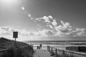
The end of the beach and the horizon are both sitting on horizontal 1/3rd lines. The subject’s body position suggests that he is looking towards the south so I have positioned him on the lower left intersection to give space to look into.
Horizontal and Vertical Frames
Camera’s are designed to be held in such a way to create horizontal images and as a result shooting horizontally becomes habitual. The aim of this exercise is to show that however strong the habit of shooting in a landscape format most images can be made to fit a Vertical (Portrait) frame. The converse is also true that objects that are by nature tall and slim can also be made to fit a horizontal frame.
The following series of images are the same scene shot in both Frames, the composition varies but they are the same scene with the exception of those containing movement.
I have included a slideshow at the end of the post to show all the compositions..
Both of these images of the same scene work, the portrait version shows the depth of the sea leading to the sun rise while the landscape version shows the expanse of the beach.
This image of the War memorial only worked for me in vertical form, even moving further away to include the flag poles would not have worked because of the imbalance caused by the memorial being closer to the right hand flag pole.
The Classic frame for the above boat would be in landscape however the portrait frame gives depth and emphasizes the motion in the sea and it’s affect on the vessel.
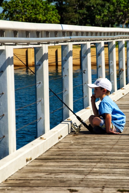
Again this image works in both aspects and the lead in line of the balcony direct the viewer to the boy and what he is doing, on reflection I prefer the vertical frame which says more about the size if the boy in relation to his surroundings and his fishing rod.
Something tall like this lighthouse naturally suits a vertical frame however the horizontal frame sets it in its environment better.
The Sunbather works in both frames and I would normally have just taken this shot in the Horizontal frame, but the Vertical gives more prominence to the Sunbather.
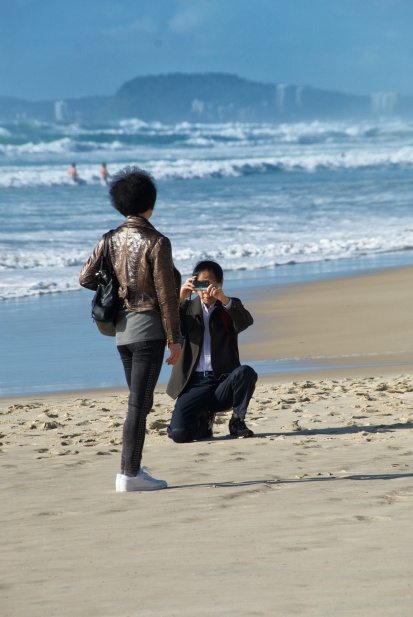
It was 0730 in the morning and 27 degrees on Surfers Paradise beach and this Japanese couple looked dressed for Church not the beach. Again both aspects work.
With a strong Horizontal feature this image suits a horizontal frame, however the vertical frame sets the rescue board in its environment better.
The vertical frame provides a feeling of the strong light and heat of the day.
Both frames work in this image. The harbour wall and fishing rod lead in to the fisherman while the rod connects with the horizon.
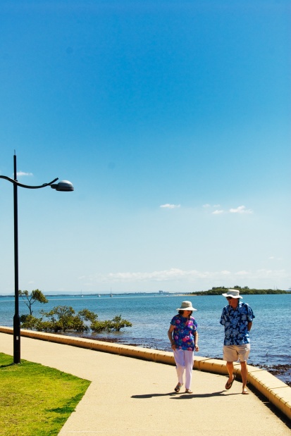
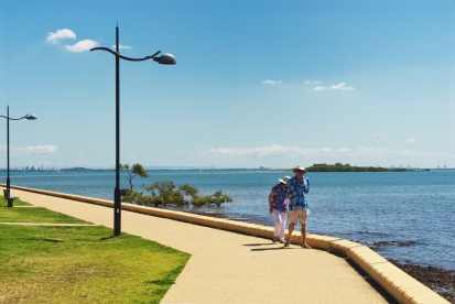
Whilst there are more symetrical elements in the horizontal frame the vertical provides a cleaner image despite the dead space at the top.
The skyscraper works in both formats. In the vertical by not dominating the space an angle is formed between the built up area and the horizon with some foreground interest.
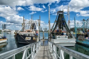
The gangway leads in to the balanced boats and onward through the end post to the tall buildings on the horizon. Because the vertical frame isolates the boats it is my preference.
Either Or!
The central Horizon with the clouds mirroring the surf gives a depth to the images. The tighter crop on the people in the water in the vertical frame further strengthens the depth.
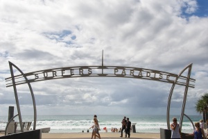
The image is about the symbolism of the sign, the horizontal crop provides a stronger image.
Either Or!
Another strong horizontal subject that works just as well in either frame.
I cannot make my mind up on these images.
These final 2 images are my favorites. The vertical frame works perfectly. In the horizontal frame I have positioned the wooden lattice centrally on purpose, to give some setting to the Lifeguard post and to illustrate why the 3 old guys are chatting to the left in the shade!
And finally here is a slideshow of all of the images for this exercise:
The Golden Section and The Rule of Thirds
There is an accepted view handed down by generations that the Golden Section (Ratio), and by the same route the Golden Spiral and the Golden Triangle explain all that is aesthetically pleasing, in nature, in art and to the human eye.
It is in fact a mathematical look at human aesthetics and over the years many have tried to use evidence found in nature to prove it correct from the Parthenon to the Pyramids and even the Mollusk shell. Televisions Learning Chanel even suggested that human beauty could be defined by this ratio and that in the most successful models the ratio between the measurements from feet to body and body to top of head; and also the width of the mouth to the width of the nose matched the Golden Ratio.
Then what is this Ratio and how does it relate to photography?
The accepted physical shape of the Golden Section is the rectangle divided to form a square and a second rectangle where the proportions of the rectangle are proportional to the main shape.
If the smaller rectangle is divided into a square the resulting rectangle will have the same proportions to its predecessor.
The exact (or nearly exact) ratio of that proportion is 1.6180339887 and is also known as PHI and is derived from the Fibonacci Sequence where starting with 0 and 1 each successive number is the sum of the previous 2 numbers:
0, 1, 1, 2, 3, 5, 8, 13, 21, 34, 55, 89, 144, 233, 376, 610, 987
The average relationship between each successive number is 1.618 (it is less defined with the lower numbers)
If in planning out an image multiple combinations of rectangles are produced then any given rectangle will produce 4 distinct points within the main rectangle or artistically, the frame.
These points though not exactly, are in similar positions to where the intersections would be of lines drawn horizontally and vertically at 1/3 intervals leaving us with the Rule of Thirds.
The Rule of Thirds was, reportedly first written of by John Thomas Smith in 1797 in his book Remarks on Rural Scenery and has become the most quoted ‘Rule’ of photographic composition. A Google search will reveal 1000’s of articles on the Rule and a You Tube search will reveal 100’s of video’s. Following any photographic forum or facebook page will reveal critiques of others work that quote “The Rule of Thirds”
It is no co-incidence that the 35mm film/sensor has a size ratio of 2×3 which conveniently divides easily into thirds.
In reviewing my own work and that of many others a vast majority of the images fit into the description of following the Rule of Thirds, is this by chance, prescription, or because it is aesthetically pleasing?
It could be a combination.
I have an issue with “The Rule of Thirds” in the arena of Art of which photography is a part.
The OED defines Art as such (www.oxforddictionaries.com)
Art
Noun:
- the expression or application of human creative skill and imagination, typically in a visual form such as painting or sculpture, producing works to be appreciated for their beauty or emotional power:
The above definition leaves no room for ‘Rules’, it talks only of creativity and imagination which cannot exist alongside rules.
Even to water them down to the status of guidelines does not do justice to creativity and imagination.
Mike Spinak in his Blog “The Golden Section Hypothesis: A Critical Look” (http://naturography.com/the-golden-section-hypothesis-a-critical-look/) not only argues that the Hypothesis behind the Golden Section is flawed and proves that the accepted examples of said Golden Section in History and Nature are also based on mis-information.
I would encourage anyone looking at the Theory of Frame Division to read and make up his or her own mind.
I am minded to agree with the work of Mike Spinak, in that while the Golden Section and ergo the Rule of Thirds may help with composition the whole basis of Art and Photography is not only about the placing of objects in a 2 dimensional space; it is more than that, it is about projecting the artist or photographers imagination and creativity through the medium of photography.
Whilst a large majority of captured images may suit, or look better when matched to the Golden Section it should not be a ‘Rule’ and most definitely should not be such a regarded measure by which the formal institutions of Photography Judge an image.
I will finish this post with the following quote from Spinak’s Blog:
“The Golden Section Hypothesis – and its approximation, the rule of thirds – take the rich enterprise of creating art, and diminish it into mere visual design”
Positioning the Horizon
The following images demonstrate the effect on the composition of positioning the horizon at different levels.
With the horizon placed in the mid point there is no particular focus to the image. The eye is not drawn in any particular way.
As the Horizon moves down there is greater emphasis on the sky whilst adding depth to the image without any particular focus in the foreground.
With the Horizon at the bottom of the image the picture is all about the sky.
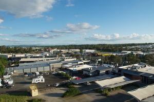
With the Horizon moving up the image there is a distinct shift to the foreground. From this series of images this is my prefered positioning for this scene. The image shows the depth of the industrial sprawl without a specific focus point leading through the image to the cenral apex of the clouds.
Now that the Horizon is at the top of the page the focus point of the viewer is brought forward to the isolated car in its parking space.
Balance
Earlier in the course I looked at the positioning of a subject within a frame however a key fundamental in composition is the concept of balance.
Balance can be the matching of shape or colour between equal objects or by positioning of unequal objects within the frame.
The exercise asks to review a selection of previously taken images to demonstrate the balance or lack of balance within them.
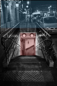
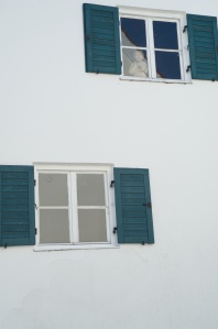
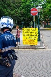
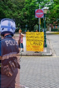
I have used an oblong mask in red or blue to identify the balance in the following selection of images from the past 12 months.
The pool of light in the underground central to the image balances the subdued light of the surrounding night scene.
The 2 windows balance each other. (Notice the statue in the window)
The window frames balance each other while the window frame is balanced against the white wall.
The 5 blocks of colour in this colour pallet painted on a wall are equally balanced.
4 Barrels = 8 Cases
In this image the balance is between the Policeman and the protest banner, I also notice a balance between the Motorcycle helmet and the No Entry sign.
The two outside vines are balanced on the fulcrum of the central vine.
The 2 girls fill the height of the frame which is balanced by the lengthened shadows stretching towards the middle right.
In reviewing these past images I was forced to look for the balance that I had not consciously considered in composition. The images of the window, beer pallet, colour pallet and vines were easy to see the balance. The Toy truck and man as well as the street protest were a little harder because of the asymmetric nature of the images. The protest made me consider foreground and background for the balance rather than left/right, top/bottom. The Paris underground image is a balance of light and it took a while to consider how much of the ambient light was balancing the light in the tunnel.
Finally the shadow image. My first thoughts were the balance between the subjects and the ground space, however consideration of the shape and form of the shadows, which were an intended secondary subject, displays a balance to the human form.
Focal Lengths – Wide Angle to Telephoto – Fixed & Changed Viewpoints
The aim of these 2 exercises is to demonstrate the difference not only between wide & telephoto images but also using physical distance as a zoom and the dramatic differences it makes to the character of the image.
Using a fixed position it is possible to include more or less in an image either by using a wide angle or telephoto lens or a Zoom lens.
When using this technique we are concentrating part of an image. That is the difference in shape and form of any object in a wide angle images is exactly the same as a telephoto images taken from the same viewpoint.
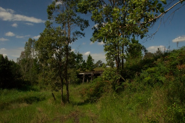
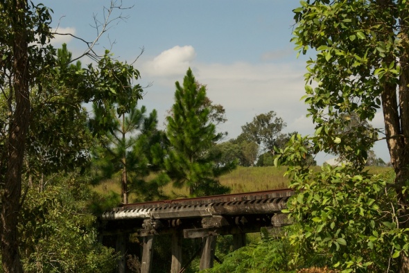
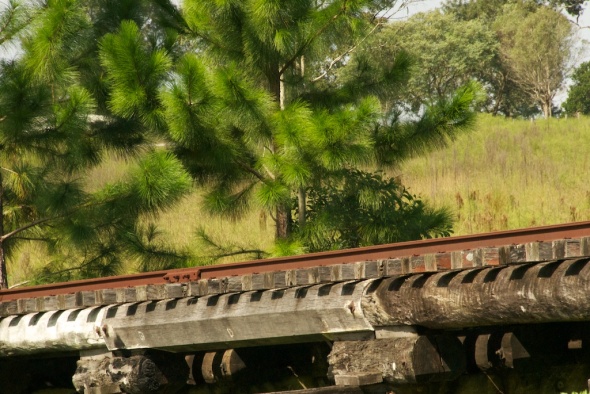
Careful study of the above show that they are in fact the same image, just a closer and closer zoom or if you like an in camera crop.
It is also clear from the perspective between image 1 and 3 that the final image would be impossible to take close up without a very large set of ladders. Therefor as an image of the brigde and tracks it shows the detail but does nothing to show perspective.
The following set of images are of the same subject but as the focal length has been changed so has the position.
At this mid point the perspective has changed, the span of the bridge can be appreciated over this overgrown dried creek.
In the final image the character of the shot has totally changed, whilst the image is of the same bridge and from the first image to the last it is easy to work out the camera position it now says a lot more to the viewer. To me it clearly shows more of the scale of the timbers used to construct the bridge and the many angles used to provide strength to the bridge also draw the eye through the picture and the supporting pillars and back following the cross members and the pasterns created by the light through them.
In basic terms by changing position:
Image 1 is a country view that includes a bridge as its focal point.
Image 2 is an image of the bridge
Image 3 is about scale & patterns in the bridge
Placeing the object in different positions
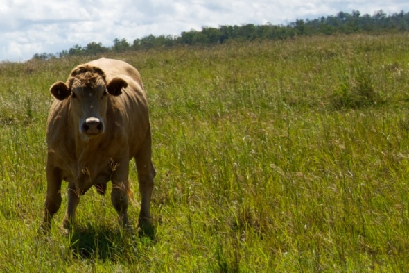
Here is a casual shot of a cow in a field, the shot was then re-composed to demonstrate how the relationship of subject and the background work together. Although these images are not an ideal representation due to a broken background however they do demonstrate positioning within the frame. I will add a second set as soon. All the images are at camera aspect of 3×2.
My preferred image:

The object is positioned above the centre line on the right hand 1/3. This is my preferred position in the frame. The stance of the cow and the positioning give the object space to move into.
Second to this image, the original suits my eye. However positioning the cow to the left of the image creates a totally different feel to the image without being awkward.
The following 2 positions do not work for my eye!
Whilst it is perfectly possible with modern technology to position every subject central to a frame and crop later, the above images show that by positioning the suject at composition can have different effects on the character of the finished image.
Part One – The Frame
Unlike Painters and Sculptors, Photographers can only (without heavy manipulation by computer programs) work with what is in front of their camera, what they see and how they compose it. Images can be cropped and manipulated but you can only work with what was there at the time the shutter was released, normally you cannot add to any photograph what was not there.
Many of us (photographers included) look without seeing, or see without understanding.
It is not just about what would make a good image but why a particular scene will make a good image.
Graham Clarke in his book ‘The Photograph’ (Oxford University Press 1997) states that “we need to insist that we read a photograph, not as an image but as a text” this statement suggests that every image should have a story to tell, Clarke further states “The photograph both mirrors and creates discourse with the world, and is never, despite its often passive way with things, a neutral representation.”
As such an image is a story and the photographer is the author, without a structure to the story it will be difficult for anyone to read; the photographer, like the author is responsible for the composition of the image, which starts with what is visualised in the eye and replicated on the viewfinder before it is captured as an image.


